Cycle of Growth
Every Stage Tells a Story of Development
How Does Branding Reflect Purpose?
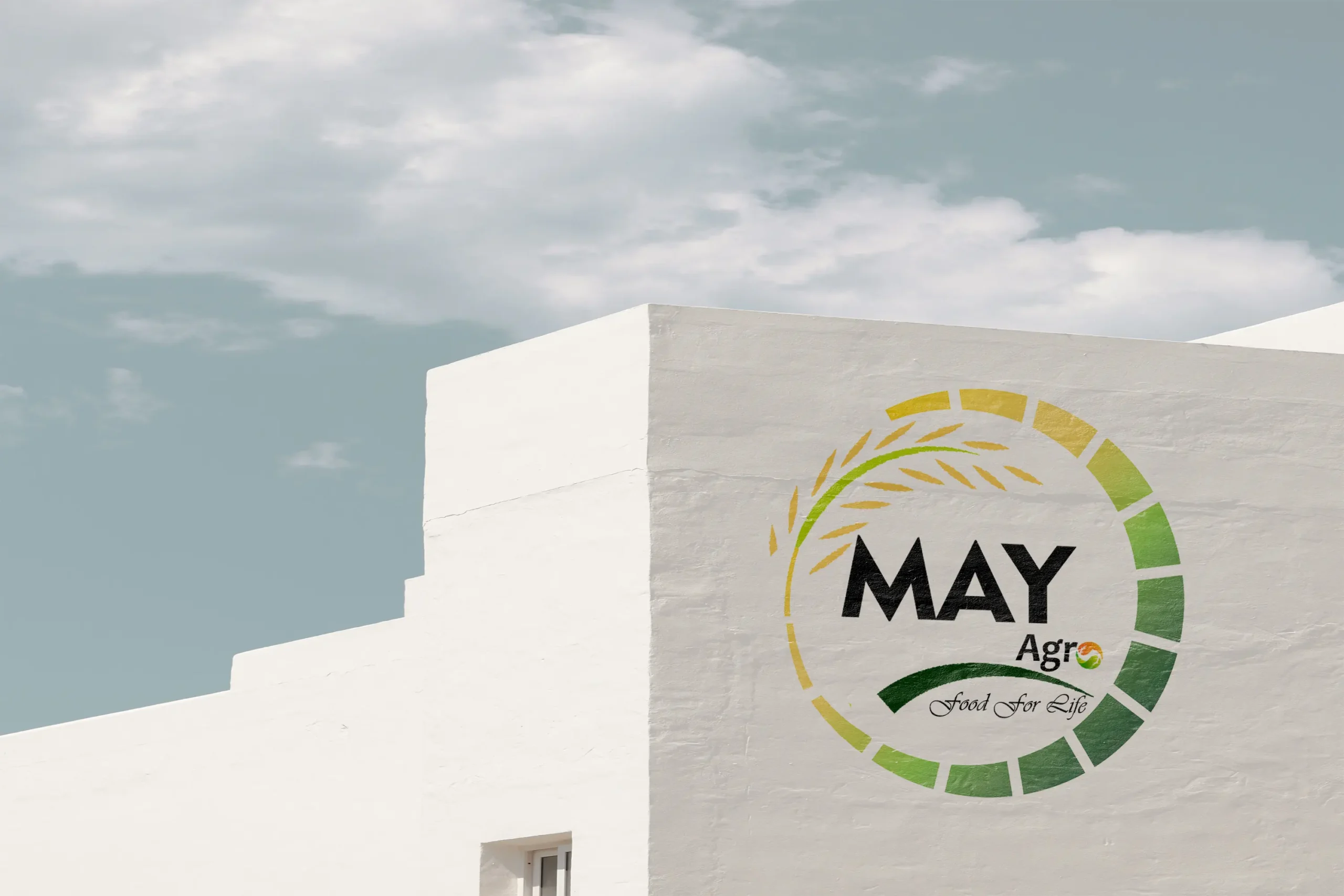
Branding reflects purpose by visually communicating a company’s core values, mission, and the essence of its work. For May Agro, we designed a distinctive logo that illustrates the full crop cycle—from seed to green phase to final maturity—symbolizing the company’s commitment to agriculture, growth, and sustainability. The letter “O” in “Agro” represents the vital heat and sunlight necessary for crop development, while the green elements signify thriving, healthy crops. This thoughtful visual language reinforces May Agro’s purpose and clearly aligns its brand identity with its role in the agricultural ecosystem.
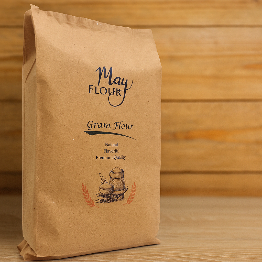
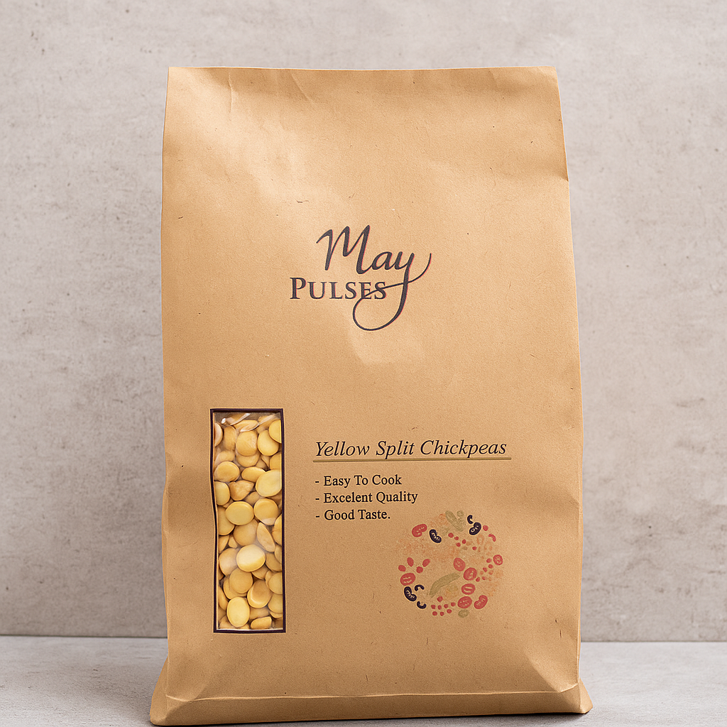
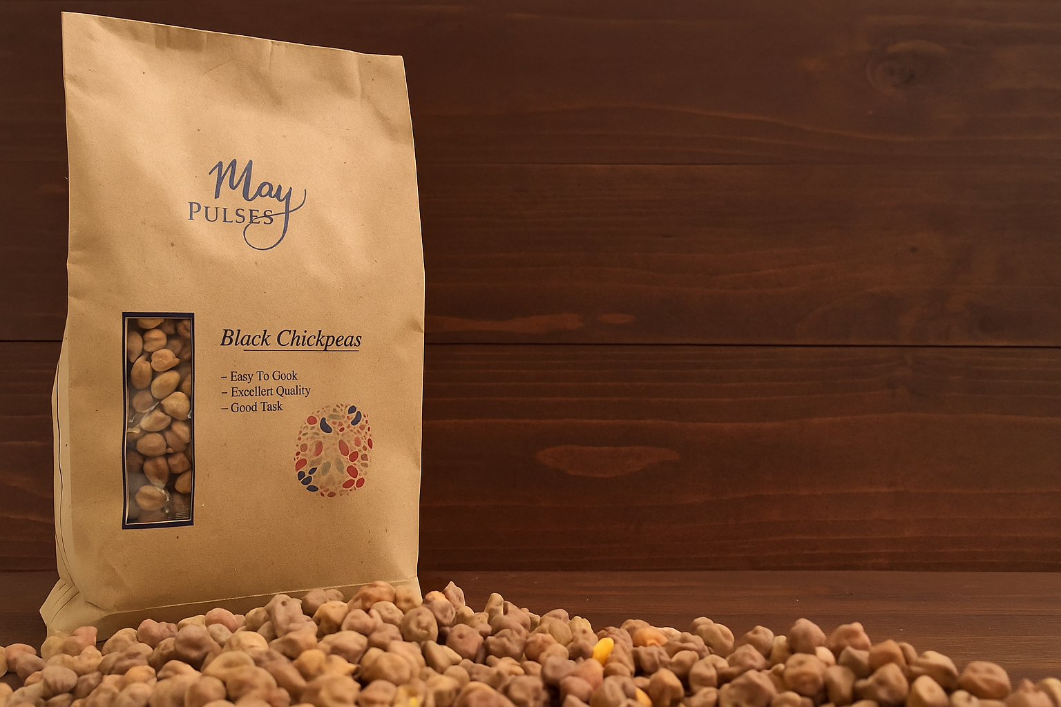
Additionally, branding extended to the packaging design, where we embraced a minimalist and eco-conscious approach. Avoiding plastic-based prints and opting for biodegradable or paper materials, the design reflects May Agro’s concern for the environment and its role in addressing climate change. In this way, every branding element—from logo to packaging—was purposefully crafted to communicate the company’s values, vision, and responsibility toward a sustainable future.
Category:
Design
Client:
May Agro

